Restaurant menu design: clarity is part of the brand
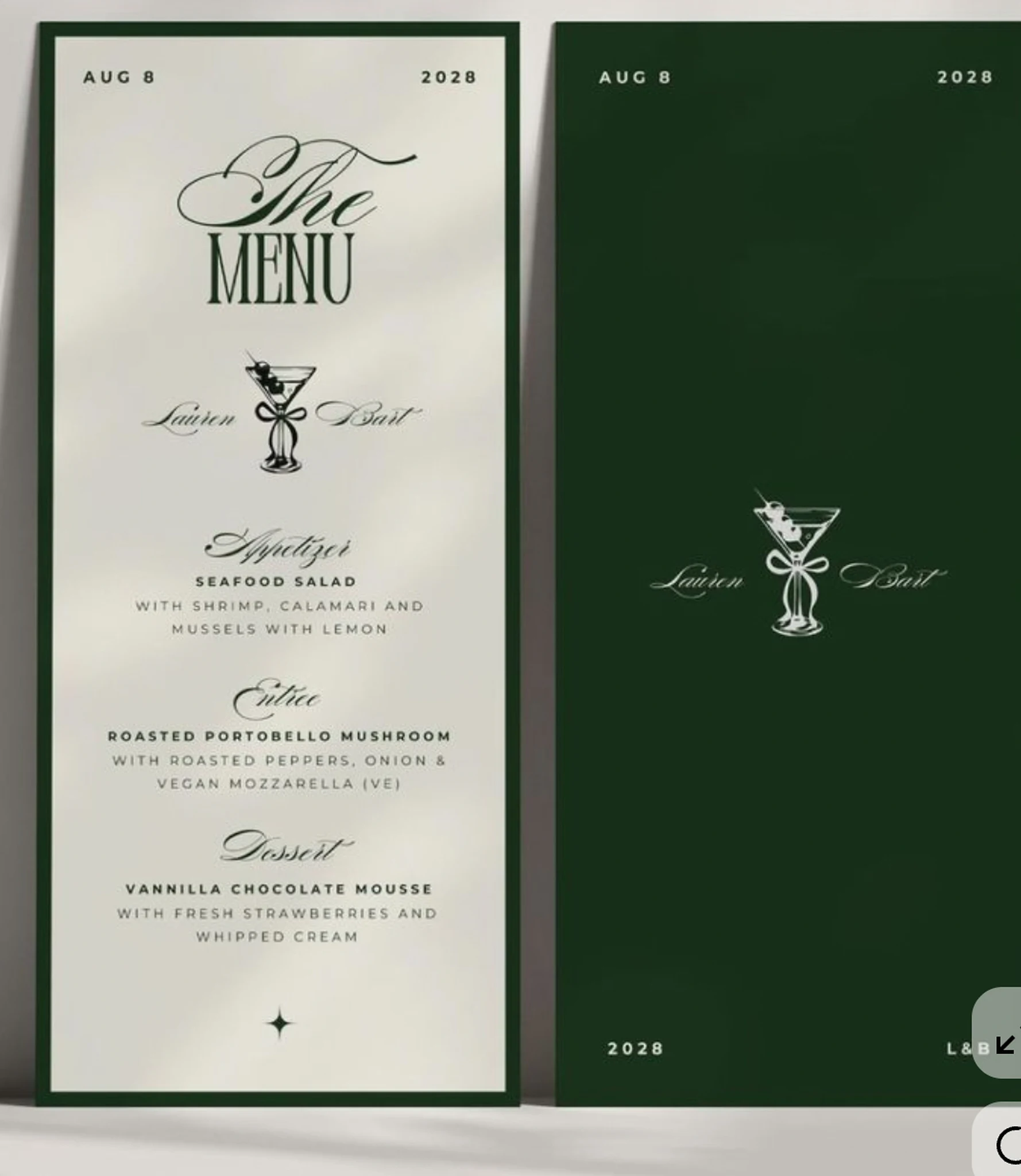
Build a hierarchy before choosing a typeface
A menu is a working part of the guest experience. Its first task is to help someone understand the offering, while its design communicates the character of the restaurant. Begin with the information: categories, dishes, descriptions, prices and any essential notes. Decide which elements need to be found quickly and which should sit quietly behind them. A distinctive typeface can add personality, but it cannot repair a confusing structure.
Let the concept guide the expression
A neighbourhood café, a lively Mediterranean restaurant and an intimate fine-dining room should not all speak in the same visual language. The paper, proportions, spacing and typography can help make the menu feel native to its setting. Consider how the piece will be held, how much light reaches the table and how often it will change. A visually restrained design can be just as expressive as an elaborate one when its details are well chosen.
Keep descriptions useful
Dish descriptions work best when they help a guest picture what will arrive. Give the culinary team a consistent pattern for ingredient names, preparation and relevant detail. Keep price formatting and punctuation consistent so that small differences do not distract from the food. Allergens, dietary information and claims about ingredients should be reviewed by the restaurant team; visual design is not a substitute for accurate operational content.
Design a system for the next update
A menu rarely stays fixed. Seasonal dishes change, wine vintages move and promotional inserts appear. Build editable files with clear text styles and predictable spacing. Check what happens when a description becomes longer or a category gains another item. The aim is to make routine updates possible without slowly losing the design’s hierarchy. The final handover should also clarify which file is the current version and which formats are intended for print and digital use.
Review it at the table
Print a proof at the intended size and review it in conditions close to the actual restaurant. Look at line length, readability, paper handling and the relationship between sections. Then check the digital version on a phone. These are different contexts, and each deserves attention. A menu that feels beautiful and easy to use can quietly reinforce the care guests expect from everything else in the room.
A practical example: the Social Corner menu
The Social Corner artwork in Fernando’s portfolio uses a compact printed format with a clear distinction between categories, dish names and supporting detail. Reviewing that kind of menu means thinking beyond a single finished composition. A changed price should not disturb alignment; a longer description should not collapse the spacing around the next dish.
A useful handover would keep dish names, descriptions and prices in consistent styles, with a repeatable review for spelling, pricing and the print version. This is an operational design decision as much as an aesthetic one.
See the Social Corner example ↗